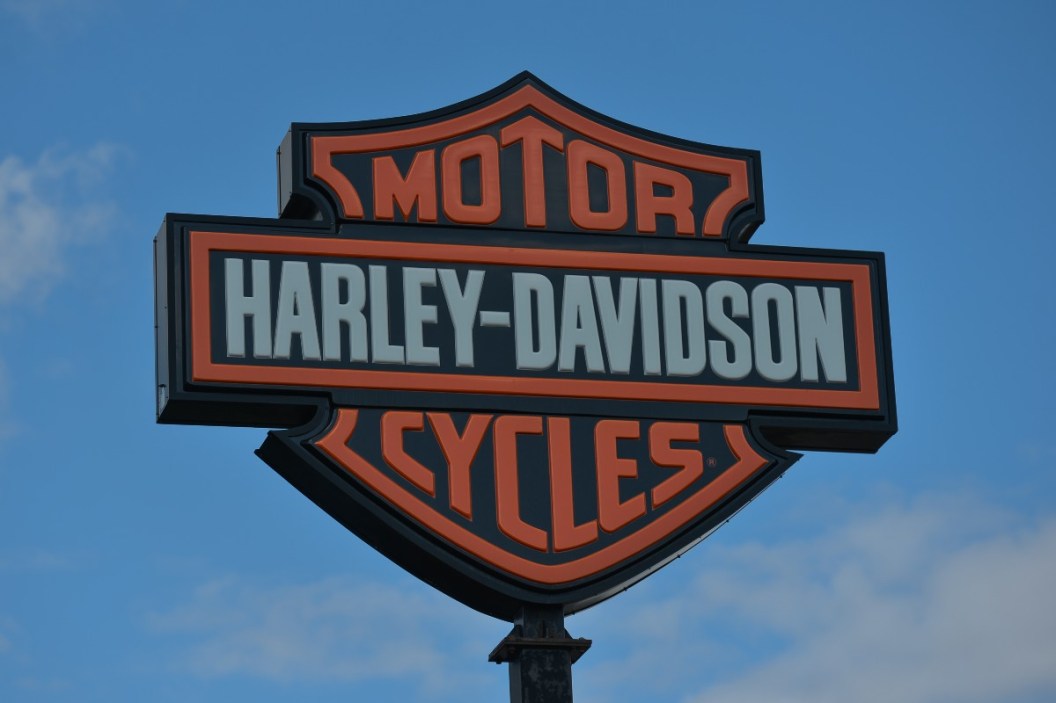
In order to make a successful company, it's beneficial to have a strong brand image. Harley-Davidson is a clear example of this. The American motorbike company was founded back in 1903 in Milwaukee, Wisconsin by William S. Harley, Walter Davidson, Arthur Davidson, and William A. Davidson.
HD was actually one of the only motorcycle manufacturers that was able to make it through the Great Depression in the United States and still be in business today. As it turns out, one of the factors that played a key role in their success was the company logo.
A Brief History of the Harley-Davidson Logo
Surprisingly, it took nine years after the company's launch until they came out with a logo design, but in 1910, they launched the original bar and shield Harley-Davidson logo. It was simple and strong, featuring just three colors: white, black, and orange. It displayed the words Harley-Davidson on the bar, with "motor" on the top half of the shield and "cycles" on the bottom half. This classic logo was by far the most famous.
It wasn't until the Harley-Davidson brand's 50th anniversary that they decided to change out the traditional bar & shield logo for a new one. The silver design still featured the bar and shield, but it was within an enclosed circle with a big protruding V to symbolize the V-twin engine being used in the bikes. They even created a medallion version of the logo, which made an appearance on the front fenders of the 1954 models. By 1965, they had reverted back to the original design once again. It was easily the most recognizable logo for the brand, however, they changed the colors to just include black and white, removing the orange color.
Read More: Did You Know These 2 Logos Were Rejected by Ford Motor Company?
By 1971, Willie Davidson made the #1 logo extremely popular. The Harley-Davidson emblems were displayed on the FX Super Glide, but prior to that, it was more popularly used in the motorcycle racing days of the company, specifically dirt track racing. The logo image has been used on multiple different T-shirts, hats, and other memorabilia promoting the motor company.
Another significant change to the logo came during 2003. Since they made a change for their 50th anniversary, it was a must to change it up for the 100th anniversary as well. Again, they retained the bar and shield, but added some silver wings with the dates 1903 and 2003 on each side, and 100 located at the bottom. It symbolized power, speed, and freedom. Exactly what you get from riding a motorcycle.
By 2008, they rolled out the 105th anniversary logo, which changed the horizontal wings to some that curved upwards. The new logo was contained within a circle, and the tips of the wings were protruded. "105 Years" was posted above the wings.
Of all the logos used throughout the Harley-Davidson motorcycle brand's history, it's safe to say that the bar and shield is the one that made the biggest impact. That's why it was incorporated into each logo that followed it. Even today, this iconic logo is recognized all over the world.
You'll become part of a family when you purchase one of these bikes. It doesn't matter if you have a Harley-Davidson sportster, dyna, or fat boy, the community is extremely welcoming. Often, Harley owners are apart of Harley Owners Groups, or HOGS, and they even feature their own symbol. It contains a banner with the words "Harley Owners Group" written on it, and "HOG" sits above it. The "O" has spokes to make it look like a wheel, and there's also a golden eagle above the letter.
If you're looking to join a community where you can surround yourself with a group of people passionate about two wheels, these are the people you're looking for.
Products featured on Alt_driver are independently selected by our editors. However, when you buy something through our links, we may earn a commission.
This post originally published on July 21, 2020.
